실내

실내 홈 데코를 위한 최고의 색상 구성표: 전문가 팁과 트렌드

집안에 완벽한 분위기를 조성하는 것은 실내 장식에 어떤 색채를 선택하는지에 따라 크게 달라집니다. 색상은 분위기, 스타일, 그리고 공간의 전반적인 느낌에 영향을 미치기 때문에 선택 과정은 흥미진진하면서도 매우 중요합니다. 차분하고 중립적인 색상 팔레트를 선호하든, 대담하고 생동감 넘치는 톤을 선호하든, 최적의 색상 조합을 이해하는 것은 […]

실내 홈 데코를 위한 최고의 색상 구성표: 전문가 팁과 트렌드더 읽기 »

공간에 질감 타일을 통합하는 방법: 종합 가이드

질감이 있는 타일을 거실 공간에 활용하면 깊이감, 입체감, 그리고 촉감을 더해 인테리어 디자인을 한층 더 돋보이게 할 수 있습니다. 매끄러운 타일과 달리, 질감이 있는 타일은 시각적인 매력을 더하고 밋밋하고 평범한 공간을 역동적이고 매력적인 공간으로 탈바꿈시켜 줍니다. 질감이 있는 타일을 효과적으로 활용하는 방법에 대한 자세한 가이드를 소개합니다.

공간에 질감 타일을 통합하는 방법: 종합 가이드더 읽기 »

색상의 예술 마스터하기: 중립적인 색상과 강렬한 색상을 효과적으로 결합하기

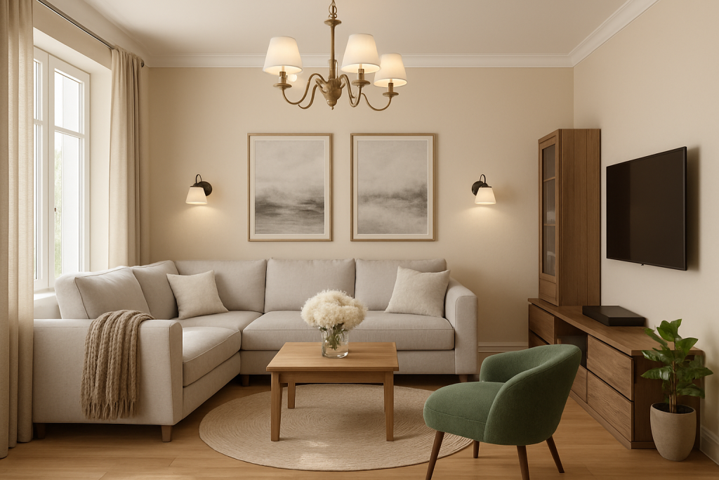
중립적인 색상은 디자인의 다재다능한 기반을 제공하며, 다른 요소들이 돋보이도록 하는 깔끔한 캔버스 역할을 합니다. [1][2] 흰색, 회색, 베이지색, 갈색과 같은 이러한 차분한 색조는 색상환의 특정 색상에 치우치지 않고 균형 잡히고 세련된 배경을 만들 수 있습니다. [2] 전략적으로 "팝" 효과를 더하면

색상의 예술 마스터하기: 중립적인 색상과 강렬한 색상을 효과적으로 결합하기더 읽기 »

Document Title
Indoor Archives - Tulip.casa
Title Attribute
Tulip.casa » Indoor Category Feed
JSON
View all posts by abduljabbar
Page Content
Indoor Archives - Tulip.casa
The Best Color Schemes for Indoor Home Decor: Expert Tips and Trends
/
abduljabbar
Creating the perfect ambiance in your home largely depends on the color schemes you choose for your indoor decor. Colors influence mood, style, and the overall feel of a space, making the selection process both exciting and crucial. Whether you prefer a calm, neutral palette or bold, vibrant tones, understanding the best color combinations can […]
Read More »
How to Incorporate Textured Tiles into Your Space: A Comprehensive Guide
Incorporating textured tiles into your living space is a powerful way to elevate your interior design by adding depth, dimension, and tactile appeal. Unlike smooth tiles, textured tiles introduce visual intrigue and can transform a flat, ordinary room into a dynamic and inviting environment. Here’s a detailed guide on how to effectively use textured tiles
Mastering the Art of Color: Effectively Combining Neutrals with Pops of Color
Neutral colors offer a versatile foundation for design, acting as a clean canvas that allows other elements to stand out [1][2]. These muted hues, such as whites, grays, beiges, and browns, do not lean toward any specific color on the color wheel and can create a balanced and sophisticated backdrop [2]. By strategically adding “pops”
Tulip.casa » Indoor Category Feed
JSON
View all posts by abduljabbar
Document Title
Page not found - Tulip.casa
Image Alt
Tulip.casa
Title Attribute
Tulip.casa » Feed
Tulip.casa » Comments Feed
RSD
Skip to content
Placeholder Attribute
Search...
Page Content
Page not found - Tulip.casa
Skip to content
Home
Blog
Garden Decor
Indoor
Main Menu
This page doesn't seem to exist.
It looks like the link pointing here was faulty. Maybe try searching?
Search for:
Search
Quick Links
Outdoors
About
Contact
Explore
Bestsellers
Hot deals
Best of The Year
Featured
Gift Cards
Help
Privacy Policy
Disclaimer
: As an Amazon Associate, we earn from qualifying purchases — at no extra cost to you.
English
العربية
Čeština
Dansk
Nederlands
Suomi
Français
Deutsch
Italiano
日本語
한국어
Norsk bokmål
Polski
Português
Română
Русский
Español
Svenska
Türkçe
My account
[woocommerce_my_account]
Tulip.casa
Tulip.casa » Feed
Tulip.casa » Comments Feed
RSD
Search...
한국어