Creating the perfect ambiance in your home largely depends on the color schemes you choose for your indoor decor. Colors influence mood, style, and the overall feel of a space, making the selection process both exciting and crucial. Whether you prefer a calm, neutral palette or bold, vibrant tones, understanding the best color combinations can transform your home into a stylish and harmonious sanctuary.
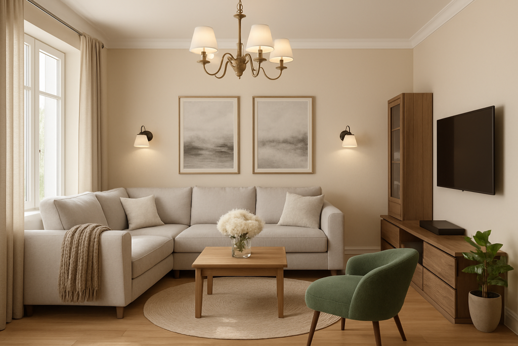
1. Calming Neutrals and Airy Tones
Neutral palettes remain a timeless favorite for indoor spaces. Shades such as taupe, ivory, beige, soft sage, and warm grays create a cozy, layered atmosphere that feels inviting and sophisticated. This approach, often referred to as warm minimalism, is ideal for those who want a serene environment with subtle texture and depth. These colors work well with natural materials like light oak and linen, enhancing the sense of calm and spaciousness in any room[1][3].
2. Rich Jewel Tones for Accent and Drama
For a more luxurious and dynamic look, incorporating jewel tones such as sapphire blue, ruby red, canary yellow, and aquamarine as accent colors can create stunning visual interest. These colors pair beautifully with neutral bases and can be introduced through rugs, cushions, or statement furniture pieces. Jewel tones add warmth and personality without overwhelming the space, making them perfect for living rooms or dining areas where you want to impress and inspire[1].
3. Coastal and Laid-Back Blues
Inspired by the tranquility of the sea, soft blues, sandy beiges, and crisp whites bring a fresh and airy feel to interiors. This palette suits coastal or farmhouse styles and is especially effective in rooms with ample natural light. Combining these soothing blues with natural wood tones and greenery can evoke a peaceful retreat-like atmosphere in your home[1][2].
4. High-Contrast Neutrals: Black, White, and Gray
For lovers of modern and minimalist design, a black and white color scheme offers a bold, graphic edge that never goes out of style. To soften the stark contrast, adding muted grays and warm tans can balance the look and add warmth. Textured fabrics, patterned rugs, and metallic accents can prevent the palette from feeling cold or clinical, making it perfect for contemporary living rooms or kitchens[1][2].
5. Earthy and Desert-Inspired Tones
Warm, earthy hues like terra cotta, sienna, cognac, and rust evoke the natural beauty of desert landscapes. Paired with creamy whites and high-contrast greenery such as cacti or leafy plants, this palette brings warmth and a grounded feeling to interiors. It works well in spaces aiming for a rustic, bohemian, or southwestern vibe[1].
6. Sweet Pastels for Softness and Relaxation
Soft pastels like dusty lavender, pale blue, mint green, and blush pink are ideal for bedrooms, nurseries, or guest rooms where a gentle, relaxing mood is desired. These colors are timeless and can be mixed and matched for a light, airy feel that soothes and comforts[1][2].
7. Eclectic Boho with Layered Colors
For those who want to infuse personality and vibrancy, an eclectic bohemian palette featuring layered teals, blues, blacks, and pops of fuchsia can create a lively and artistic space. Gold hardware and varied textures complement this look, making it perfect for creative living areas or studios[1].
Practical Tips for Choosing Your Color Scheme
- Consider natural light: Colors appear differently depending on the light in each room.
- Start with a dominant color: Build your palette around one main hue and add secondary and accent colors.
- Match your style: Certain colors resonate better with specific design styles, such as coastal, modern, or rustic.
- Use the color wheel: Complementary or analogous colors can help create harmony or contrast.
- Don’t fear change: Paint and decor can be updated if your preferences evolve[2][3].
Choosing the right color scheme for your indoor home decor is a blend of art and science that can profoundly affect how you experience your living space. Whether you lean towards soothing neutrals, bold jewel tones, or playful pastels, the key is to create a palette that reflects your personality and lifestyle while maintaining balance and cohesion throughout your home.
[1] https://havenly.com/blog/color-palette-for-home
[2] https://artsfiesta.com/top-interior-color-scheme-for-your-home-decor/
[3] https://www.benjaminmoore.com/en-us/color-overview/color-palettes/whole-house-color-schemes